# 展示数据集Salaries > library(car) 载入需要的程辑包:carData > head(Salaries) rank discipline yrs.since.phd yrs.service sex salary 1 Prof B 1918 Male 139750 2 Prof B 2016 Male 173200 3 AsstProf B 43 Male 79750 4 Prof B 4539 Male 115000 5 Prof B 4041 Male 141500 6 AssocProf B 66 Male 97000
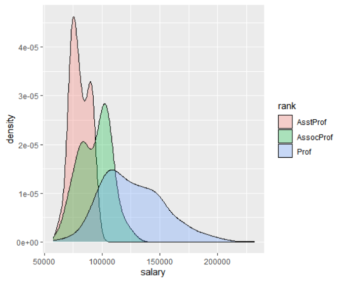
> library(car) > head(Salaries) rank discipline yrs.since.phd yrs.service sex salary 1 Prof B 1918 Male 139750 2 Prof B 2016 Male 173200 3 AsstProf B 43 Male 79750 4 Prof B 4539 Male 115000 5 Prof B 4041 Male 141500 6 AssocProf B 66 Male 97000 > ggplot(data=Salaries, aes(x=salary, fill=rank))+ geom_density(alpha=.3)
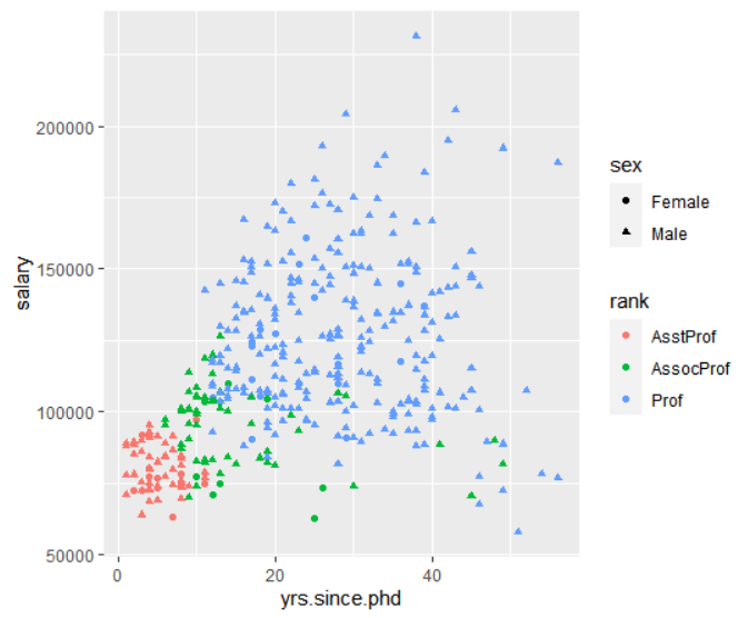
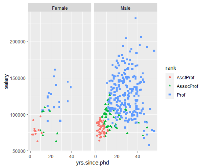
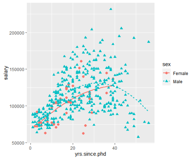
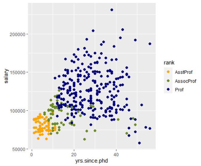
> head(Salaries) rank discipline yrs.since.phd yrs.service sex salary 1 Prof B 1918 Male 139750 2 Prof B 2016 Male 173200 3 AsstProf B 43 Male 79750 4 Prof B 4539 Male 115000 5 Prof B 4041 Male 141500 6 AssocProf B 66 Male 97000 > ggplot(Salaries, aes(x=yrs.since.phd, y=salary, color=rank, shape=sex))+ geom_point()
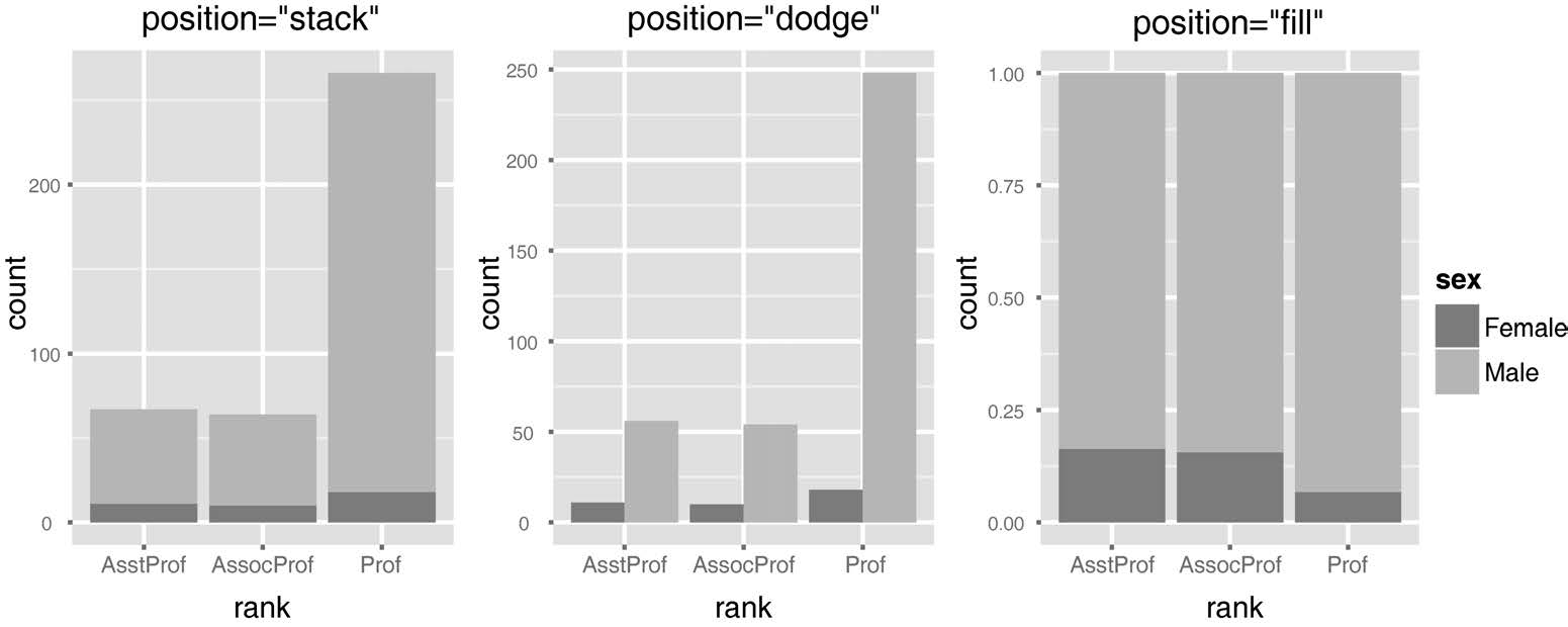
> head(Salaries) rank discipline yrs.since.phd yrs.service sex salary 1 Prof B 1918 Male 139750 2 Prof B 2016 Male 173200 3 AsstProf B 43 Male 79750 4 Prof B 4539 Male 115000 5 Prof B 4041 Male 141500 6 AssocProf B 66 Male 97000 > ggplot(Salaries, aes(x=rank, fill=sex))+ geom_bar(position="stack")+ labs(title='position="stack"')
> library(car) > head(Salaries) rank discipline yrs.since.phd yrs.service sex salary 1 Prof B 1918 Male 139750 2 Prof B 2016 Male 173200 3 AsstProf B 43 Male 79750 4 Prof B 4539 Male 115000 5 Prof B 4041 Male 141500 6 AssocProf B 66 Male 97000
> library(car) > head(Salaries) rank discipline yrs.since.phd yrs.service sex salary 1 Prof B 1918 Male 139750 2 Prof B 2016 Male 173200 3 AsstProf B 43 Male 79750 4 Prof B 4539 Male 115000 5 Prof B 4041 Male 141500 6 AssocProf B 66 Male 97000
> library(car) 载入需要的程辑包:carData > head(Salaries) rank discipline yrs.since.phd yrs.service sex salary 1 Prof B 1918 Male 139750 2 Prof B 2016 Male 173200 3 AsstProf B 43 Male 79750 4 Prof B 4539 Male 115000 5 Prof B 4041 Male 141500 6 AssocProf B 66 Male 97000
> library(car) 载入需要的程辑包:carData > head(Salaries) rank discipline yrs.since.phd yrs.service sex salary 1 Prof B 1918 Male 139750 2 Prof B 2016 Male 173200 3 AsstProf B 43 Male 79750 4 Prof B 4539 Male 115000 5 Prof B 4041 Male 141500 6 AssocProf B 66 Male 97000
element_text( family =NULL, face =NULL, colour =NULL, size =NULL, hjust =NULL, vjust =NULL, angle =NULL, lineheight =NULL, color =NULL, margin =NULL, debug =NULL, inherit.blank =FALSE )
rel(x)
相关参数:
参数
描述
t, r, b, l
Dimensions of each margin. (To remember order, think trouble).
unit
Default units of dimensions. Defaults to “pt” so it can be most easily scaled with the text.
fill
Fill colour.
colour, color
Line/border colour. Color is an alias for colour.
linetype
Line type. An integer (0:8), a name (blank, solid, dashed, dotted, dotdash, longdash, twodash), or a string with an even number (up to eight) of hexadecimal digits which give the lengths in consecutive positions in the string.
inherit.blank
Should this element inherit the existence of an element_blank among its parents? If TRUE the existence of a blank element among its parents will cause this element to be blank as well. If FALSE any blank parent element will be ignored when calculating final element state.
lineend
Line end Line end style (round, butt, square)
arrow
Arrow specification, as created by grid::arrow()
family
Font family
face
Font face (“plain”, “italic”, “bold”, “bold.italic”)
hjust
Horizontal justification (in [0, 1])
vjust
Vertical justification (in [0, 1])
angle
Angle (in [0, 360])
margin
Margins around the text. See margin() for more details. When creating a theme, the margins should be placed on the side of the text facing towards the center of the plot.
debug
If TRUE, aids visual debugging by drawing a solid rectangle behind the complete text area, and a point where each label is anchored.
x
A single number specifying size relative to parent element.
grid::arrow()
Produces a description of what arrows to add to a line. The result can be passed to a function that draws a line, e.g., grid.lines.
Usage:
1
2
arrow(angle =30,length= unit(0.25,"inches"), ends ="last", type ="open")
参数
描述
angle
The angle of the arrow head in degrees (smaller numbers produce narrower, pointier arrows). Essentially describes the width of the arrow head.
length
A unit specifying the length of the arrow head (from tip to base).
ends
One of “last”, “first”, or “both”, indicating which ends of the line to draw arrow heads.
type
One of “open” or “closed” indicating whether the arrow head should be a closed triangle.
> library(car) 载入需要的程辑包:carData > head(Salaries) rank discipline yrs.since.phd yrs.service sex salary 1 Prof B 1918 Male 139750 2 Prof B 2016 Male 173200 3 AsstProf B 43 Male 79750 4 Prof B 4539 Male 115000 5 Prof B 4041 Male 141500 6 AssocProf B 66 Male 97000
> library(car) > head(Salaries) rank discipline yrs.since.phd yrs.service sex salary 1 Prof B 1918 Male 139750 2 Prof B 2016 Male 173200 3 AsstProf B 43 Male 79750 4 Prof B 4539 Male 115000 5 Prof B 4041 Male 141500 6 AssocProf B 66 Male 97000
Device to use. Can either be a device function (e.g. png()), or one of “eps”, “ps”, “tex” (pictex), “pdf”, “jpeg”, “tiff”, “png”, “bmp”, “svg” or “wmf” (windows only).
path
Path of the directory to save plot to: path and filename are combined to create the fully qualified file name. Defaults to the working directory.
scale
Multiplicative scaling factor.
width, height, units
Plot size in units (“in”, “cm”, or “mm”). If not supplied, uses the size of current graphics device.
dpi
Plot resolution. Also accepts a string input: “retina” (320), “print” (300), or “screen” (72). Applies only to raster output types.
limitsize
When TRUE (the default), ggsave will not save images larger than 50x50 inches, to prevent the common error of specifying dimensions in pixels.
# delete files with base::unlink() unlink("mtcars.pdf") unlink("mtcars.png")
# specify device when saving to a file with unknown extension # (for example a server supplied temporary file) file <- tempfile() ggsave(file, device ="pdf") unlink(file)
# save plot to file without using ggsave p <- ggplot(mtcars, aes(mpg, wt))+ geom_point() png("mtcars.png") print(p) dev.off()