一、散点图 R中创建散点图的基础函数是plot(x, y),其中,x和y是数值型向量,代表着图形中的(x, y)点。
在这个例子当中,使用 mtcars 预设数据集来进行演示:
1
2
3
4
5
6
7
8
> head( mtcars) 21.0 6 160 110 3.90 2.620 16.46 0 1 4 4 21.0 6 160 110 3.90 2.875 17.02 0 1 4 4 710 22.8 4 108 93 3.85 2.320 18.61 1 1 4 1 4 Drive 21.4 6 258 110 3.08 3.215 19.44 1 0 3 1 18.7 8 360 175 3.15 3.440 17.02 0 0 3 2 18.1 6 225 105 2.76 3.460 20.22 1 0 3 1
散点图矩阵 R中有很多创建散点图矩阵的实用函数。pairs()函数可以创建基础的散点图矩阵。下面的代码生成了一个散点图矩阵,包含mpg、disp、drat和wt四个变量,在这个图中,可以看到分别以其中两个变量作为x, y值的散点图:
1 2 3 4 ( formula, = NULL , ..., subset, = stats:: na.pass)
1 2 3 4 5 6 7 8 9 ( x, labels, panel = points, ..., = 1 : nc, verInd = 1 : nc, = panel, upper.panel = panel, = NULL , text.panel = textPanel, = 0.5 + has.diag/ 3 , line.main = 3 , = NULL , font.labels = 1 , = TRUE , gap = 1 , log = "" , = ! row1attop, verOdd = ! row1attop)
1 2 3 pairs( ~ mpg+ disp+ drat+ wt, = mtcars, = "Basic Scatter Plot Matrix" )
可以控制参数,调整只显示上方三角或下方三角的图:
1 2 3 4 5 6 7 8 9 10 11 ( ~ mpg+ disp+ drat+ wt, = mtcars, = "Basic Scatter Plot Matrix" , = NULL ) ( ~ mpg+ disp+ drat+ wt, = mtcars, = "Basic Scatter Plot Matrix" , = NULL )
car包中的scatterplotMatrix()函数也可以生成散点图矩阵,它增强了散点图的许多功能,它可以很方便地绘制散点图,并能添加拟合曲线、边界箱线图和置信椭圆,还可以按子集绘图和交互式地识别点。
有以下可选操作:
以某个因子为条件绘制散点图矩阵;
包含线性和平滑拟合曲线;
在主对角线放置箱线图、密度图或者直方图;
在各单元格的边界添加轴须图。
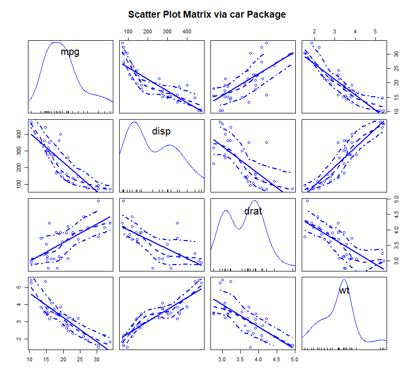
例:线性和平滑(loess)拟合曲线被默认添加,主对角线处添加了核密度曲线和轴须图。spread = FALSE选项表示不添加展示分散度和对称信息的直线,smoother.args=list(lty=2)设定平滑(loess)拟合曲线使用虚线而不是实线。
1 2 3 4 5 6 library( car) ( ~ mpg + disp + drat + wt, = mtcars, = FALSE , = list ( lty= 2 ) , = "Scatter Plot Matrix via car Package" )
R提供了许多其他的方式来创建散点图矩阵。你可能想探索glus包中的cpars()函数,TeachingDemos包中的pairs2()函数,HH包中的xysplom()函数,ResourceSelection包中的kepairs()函数和SMPracticals包中的pairs.mod()函数。每个包都加入了自己独特的曲线。
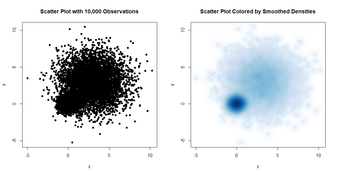
高密度散点图 当数据点重叠很严重时,用散点图来观察变量关系就显得“力不从心”了。下面是一个人为设计的例子,其中10000个观测点分布在两个重叠的数据群中:
1 2 3 4 5 6 7 8 9 10 11 12 13 14 15 16 17 18 19 20 21 22 23 24 25 26 27 28 29 30 31 32 33 34 35 36 37 38 39 40 41 42 43 44 45 > set.seed( 1234 ) > n <- 10000 > c1 <- matrix( rnorm( n, mean= 0 , sd= .5 ) , ncol= 2 ) > c2 <- matrix( rnorm( n, mean= 3 , sd= 2 ) , ncol= 2 ) > mydata <- rbind( c1, c2) > head( mydata) [ , 1 ] [ , 2 ] [ 1 , ] - 0.6035329 - 0.4125721 [ 2 , ] 0.1387146 0.1735841 [ 3 , ] 0.5422206 - 0.4600465 [ 4 , ] - 1.1728489 - 0.1436682 [ 5 , ] 0.2145623 - 0.2755651 [ 6 , ] 0.2530279 0.4243228 > typeof( mydata) [ 1 ] "double" > mydata <- as.data.frame( mydata) > head( mydata) 1 - 0.6035329 - 0.4125721 2 0.1387146 0.1735841 3 0.5422206 - 0.4600465 4 - 1.1728489 - 0.1436682 5 0.2145623 - 0.2755651 6 0.2530279 0.4243228 > typeof( mydata) [ 1 ] "list" > names ( mydata) <- c ( "x" , "y" ) > typeof( mydata) [ 1 ] "list" > head( mydata) 1 - 0.6035329 - 0.4125721 2 0.1387146 0.1735841 3 0.5422206 - 0.4600465 4 - 1.1728489 - 0.1436682 5 0.2145623 - 0.2755651 6 0.2530279 0.4243228
生成散点图:
1 2 3 attach( mydata) ( x, y, pch= 19 , main= "Scatter Plot with 10,000 Observations" ) ( mydata)
smoothScatter()函数可利用核密度估计生成用颜色密度来表示点分布的散点图。
1 2 3 4 5 6 7 8 smoothScatter( x, y = NULL , nbin = 128 , bandwidth, = colorRampPalette( c ( "white" , blues9) ) , = 100 , ret.selection = FALSE , = "." , cex = 1 , col = "black" , = function ( x) x^ .25 , = box, = NULL , ylab = NULL , xlim, ylim, = par( "xaxs" ) , yaxs = par( "yaxs" ) , ...)
代码如下:
1 2 3 attach( mydata) ( x, y, main= "Scatter Plot Colored by Smoothed Densities" ) ( mydata)
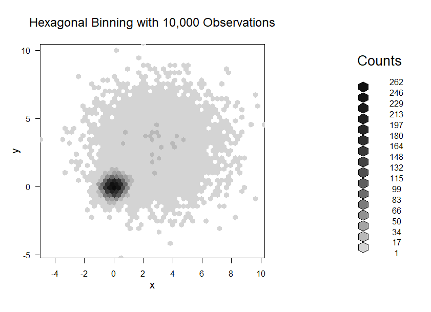
hexbin包中的hexbin()函数将二元变量的封箱放到六边形单元格中(图形比名称更直观)。
1 2 3 hexbin( x, y, xbins = 30 , shape = 1 , = range ( x) , ybnds = range ( y) , = NULL , ylab = NULL , IDs = FALSE )
示例如下:
1 2 3 4 5 library( hexbin) ( mydata, { <- hexbin( x, y, xbins= 50 ) ( bin, main= "Hexagonal Binning with 10,000 Observations" ) } )
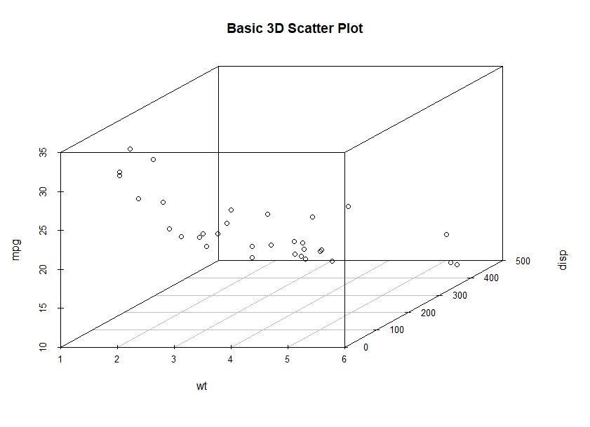
三维散点图 1. 静态 可用scatterplot3d包中的scatterplot3d()函数来绘制三维散点图
1 2 ( formula, data, subset, radius, xlab, ylab, zlab, id= FALSE , ...)
1 2 3 4 5 6 7 8 9 10 11 12 13 14 15 16 17 18 19 20 21 22 23 24 25 ( x, y, z, = deparse( substitute ( x) ) , ylab= deparse( substitute ( y) ) , = deparse( substitute ( z) ) , axis.scales= TRUE , axis.ticks= FALSE , = 0 , = c ( "white" , "black" ) , = if ( bg.col == "white" ) c ( "darkmagenta" , "black" , "darkcyan" ) else c ( "darkmagenta" , "white" , "darkcyan" ) , = carPalette( ) [ - 1 ] , surface.alpha= 0.5 , = "magenta" , pos.res.col= "cyan" , = if ( bg.col == "white" ) "black" else "gray" , = "yellow" , text.col= axis.col, = if ( bg.col == "white" ) "black" else "gray" , = c ( "exp2" , "linear" , "exp" , "none" ) , = ( length ( fit) == 1 ) , = TRUE , fill= TRUE , = TRUE , grid.lines= 26 , df.smooth= NULL , df.additive= NULL , = 1 , radius= 1 , threshold= 0.01 , speed= 1 , fov= 60 , = "linear" , groups= NULL , parallel= TRUE , = FALSE , level= 0.5 , ellipsoid.alpha= 0.1 , id= FALSE , = FALSE , ...) ( x, y, z, axis.scales= TRUE , groups = NULL , labels = 1 : length ( x) , = c ( "blue" , "green" , "orange" , "magenta" , "cyan" , "red" , "yellow" , "gray" ) , = ( ( 100 / length ( x) ) ^ ( 1 / 3 ) ) * 0.02 )
satterplot3d()函数提供了许多选项,包括设置图形符号、轴、颜色、线条、网格线、突出显示和角度等功能。
示例如下:
1
2
3
4
5
6
7
> library( scatterplot3d) > scatterplot3d( x, y, z) > library( scatterplot3d) > attach( mtcars) > scatterplot3d( wt, disp, mpg, = "Basic 3D Scatter Plot" ) > detach( mtcars)
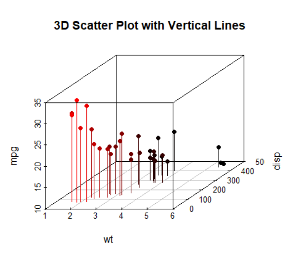
突出显示例:
1 2 3 4 5 6 7 8 library( scatterplot3d) ( mtcars) ( wt, disp, mpg, = 16 , = TRUE , = "h" , = "3D Scatter Plot with Vertical Lines" ) ( mtcars)
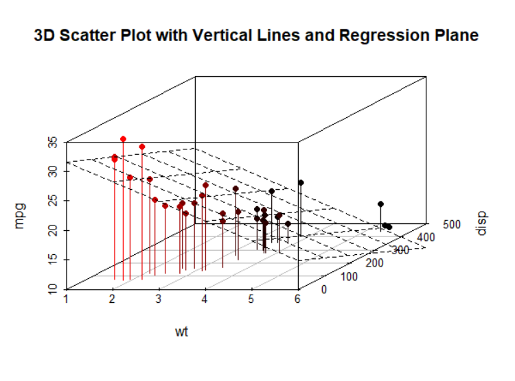
添加回归面:
1
2
3
4
5
6
7
8
9
> attach( mtcars) > s3d <- scatterplot3d( wt, disp, mpg, = 16 , = TRUE , = "h" , = "3D Scatter Plot with Vertical Lines and Regression Plane" ) > fit <- lm( mpg ~ wt+ disp) > s3d$ plane3d( fit) > detach( mtcars)
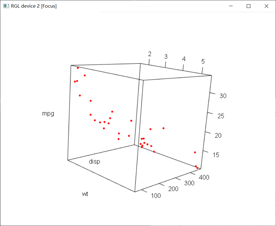
2. 旋转可交互式三维散点图 如果能对三维散点图进行交互式操作,那么图形将会更好解释。R提供了一些旋转图形的功能,让你可以从多个角度观测绘制的数据点。
可用rgl包中的plot3d()函数创建可交互的三维散点图。你能通过鼠标对图形进行旋转。函数格式为:
1 2 3 4 5 6 7 ( x, y, z, , ylab, zlab, type = "p" , col, , lwd, radius, = FALSE , aspect = ! add, = NULL , ylim = NULL , zlim = NULL , = FALSE , ...)
1 2 3 4 5 6 7 8 ( x, xlab = "x" , ylab = "y" , zlab = "z" , type = c ( "shade" , "wire" , "dots" ) , = FALSE , aspect = ! add, ...) ( xlim, ylim, zlim, = "x" , ylab = "y" , zlab = "z" , = TRUE , axes = TRUE , main = NULL , sub = NULL , = TRUE , aspect = FALSE , expand = 1.03 , )
例:
1 2 3 4 library( rgl) ( mtcars) ( wt, disp, mpg, col= "red" , size= 5 ) ( mtcars)
之后会出现这样的一个可交互的界面,可以通过鼠标来对模型进行旋转操作:
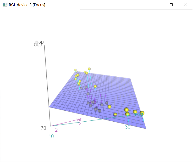
用car包中类似的函数scatter3d()也可以实现交互效果:
1 2 ( formula, data, subset, radius, xlab, ylab, zlab, id= FALSE , ...)
1 2 3 4 5 6 7 8 9 10 11 12 13 14 15 16 17 18 19 20 21 22 23 24 25 ( x, y, z, = deparse( substitute ( x) ) , ylab= deparse( substitute ( y) ) , = deparse( substitute ( z) ) , axis.scales= TRUE , axis.ticks= FALSE , = 0 , = c ( "white" , "black" ) , = if ( bg.col == "white" ) c ( "darkmagenta" , "black" , "darkcyan" ) else c ( "darkmagenta" , "white" , "darkcyan" ) , = carPalette( ) [ - 1 ] , surface.alpha= 0.5 , = "magenta" , pos.res.col= "cyan" , = if ( bg.col == "white" ) "black" else "gray" , = "yellow" , text.col= axis.col, = if ( bg.col == "white" ) "black" else "gray" , = c ( "exp2" , "linear" , "exp" , "none" ) , = ( length ( fit) == 1 ) , = TRUE , fill= TRUE , = TRUE , grid.lines= 26 , df.smooth= NULL , df.additive= NULL , = 1 , radius= 1 , threshold= 0.01 , speed= 1 , fov= 60 , = "linear" , groups= NULL , parallel= TRUE , = FALSE , level= 0.5 , ellipsoid.alpha= 0.1 , id= FALSE , = FALSE , ...) ( x, y, z, axis.scales= TRUE , groups = NULL , labels = 1 : length ( x) , = c ( "blue" , "green" , "orange" , "magenta" , "cyan" , "red" , "yellow" , "gray" ) , = ( ( 100 / length ( x) ) ^ ( 1 / 3 ) ) * 0.02 )
例:
1
2
3
> library( car) > with( mtcars, ( wt, disp, mpg) )
效果如下:
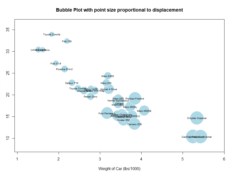
气泡图 气泡图(bubble plot)即先创建一个二维散点图,然后用点的大小来代表第三个变量的值。
可用symbols()函数来创建气泡图。该函数可以在指定的(x , y )坐标上绘制圆圈图、方形图、星形图、温度计图和箱线图。
1 2 3 4 5 symbols( x, y = NULL , circles, squares, rectangles, stars, , boxplots, inches = TRUE , add = FALSE , = par( "col" ) , bg = NA , = NULL , ylab = NULL , main = NULL , = NULL , ylim = NULL , ...)
以绘制圆圈图为例:
symbols(x, y, circle=radius) , 其中x、y和radius是需要设定的向量,分别表示x、y坐标和圆圈半径。
如果想用面积而不是半径来表示第三个变量,那么按照圆圈半径的公式($r = \sqrt{\frac{A}{\pi}}$ )变换即可:symbols(x, y, circle=sqrt(z/pi))
1
2
3
4
5
6
7
8
9
> r <- sqrt ( disp/ pi ) > symbols( wt, mpg, circle= r, inches= 0.30 , = "white" , bg= "lightblue" , = "Bubble Plot with point size proportional to displacement" , = "Miles Per Gallon" , = "Weight of Car (lbs/1000)" ) > text( wt, mpg, rownames( mtcars) , cex= 0.6 ) > detach( mtcars)
效果:
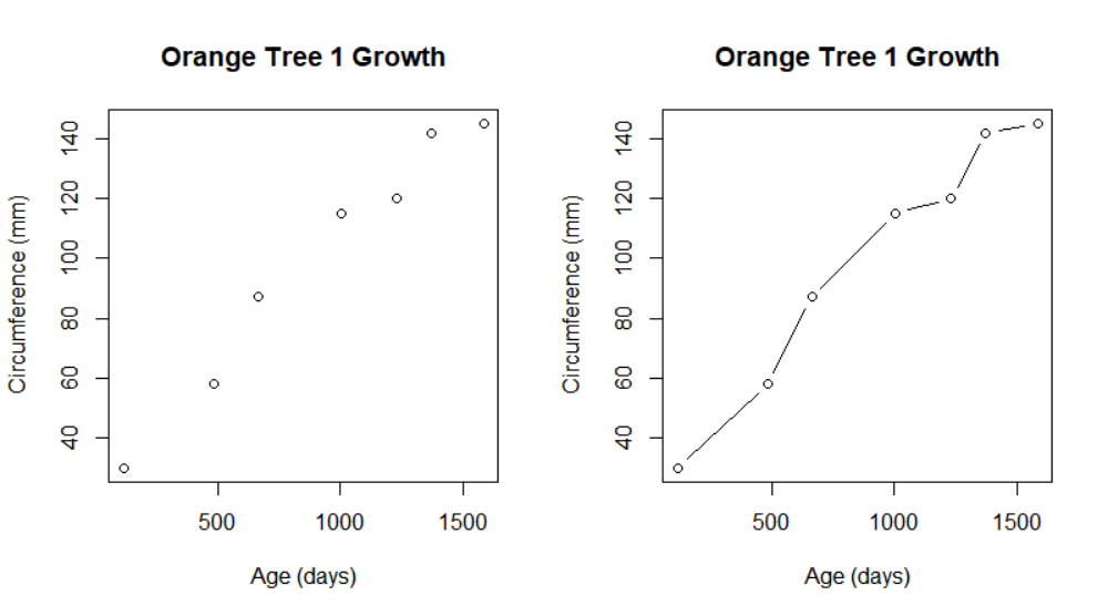
二、折线图 这部分以R内置的Orange数据集为例:
1
2
3
4
5
6
7
8
> head( Orange) 1 1 118 30 2 1 484 58 3 1 664 87 4 1 1004 115 5 1 1231 120 6 1 1372 142
如果将散点图上的点从左往右连接起来,就会得到一个折线图.
相关函数及参数 折线图一般可用下列两个函数之一来创建:
plot(x, y, type=)
lines(x, y, type=)
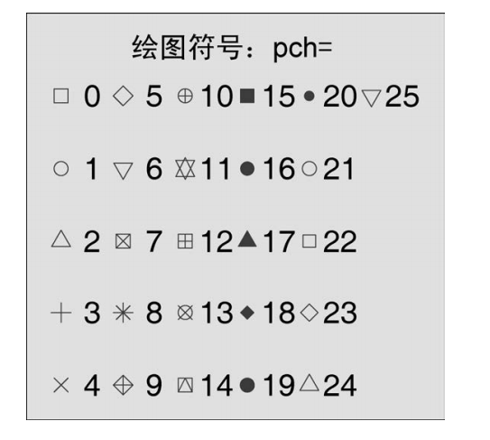
1. 点类型
参数
描述
pch (plotting character)
指定绘制点时使用的符号
cex
指定符号的大小。cex 是一个数值,表示绘图符号相对于默认大小的缩放倍数。默认大小为 1,1.5 表示放大为默认值的 1.5 倍,0.5 表示缩小为默认值的 50%,等等
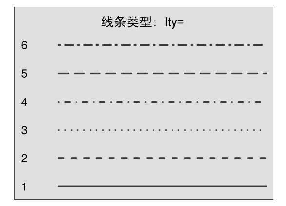
2. 线条类型
参数
描述
lty
指定线条类型
lwd
指定线条宽度。lwd 是以默认值的相对大小来表示的(默认值为 1)。例如,lwd=2 将生成一条两倍于默认宽度的线条
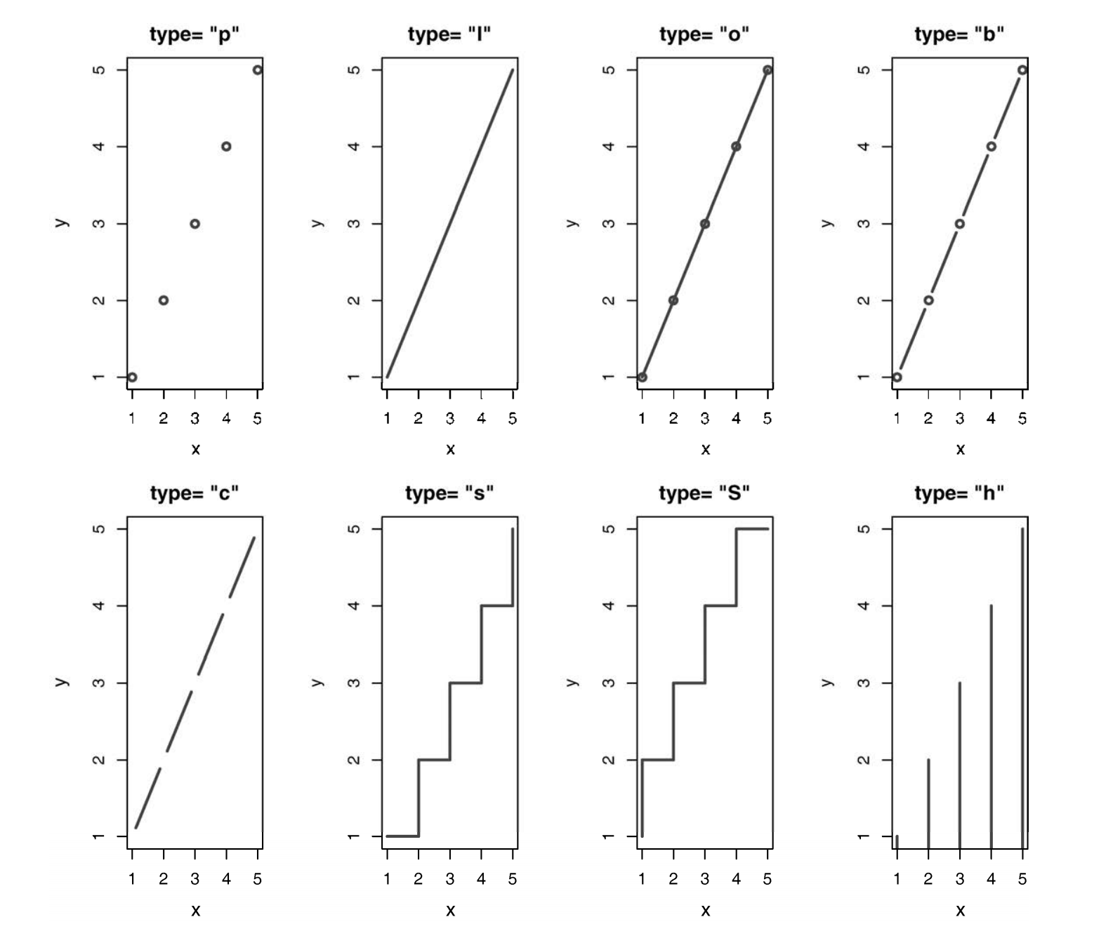
3. 参数:type 参数type指定图像类型:
参数(type=)
类型
p
只有点
l
只有线
o
实心点和线(即线覆盖在点上)
b、c
线连接点(c 时不绘制点)
s、S
阶梯线
h
直方图式的垂直线
n
不生成任何点和线(通常用来为后面的命令创建坐标轴)
4. 示例 在绘制单一数据集的折线图的时候,在plot, line函数中直接调用数据集:
1
2
3
4
5
6
7
8
9
10
11
12
13
> opar <- par( no.readonly = TRUE ) > par( mfrow= c ( 1 , 2 ) ) > t1 <- subset( Orange, Tree== 1 ) > plot( t1$ age, t1$ circumference, = "Age (days)" , = "Circumference (mm)" , = "Orange Tree 1 Growth" ) > plot( t1$ age, t1$ circumference, = "Age (days)" , = "Circumference (mm)" , = "Orange Tree 1 Growth" , = "b" ) > par( opar)
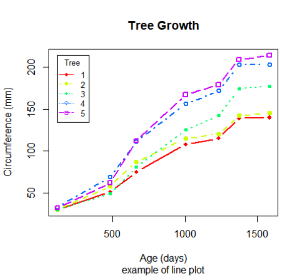
在绘制多个数据集的时候,即将多个折线放在同一张图里时,则先使用plot函数绘制出一个只有坐标轴的空的区域,之后再向上添加折线:
1 2 3 4 5 6 7 8 9 10 11 12 13 14 15 16 17 18 19 20 21 22 23 24 25 26 27 28 29 30 31 32 33 34 35 36 37 38 39 40 41 42 43 44 45 46 47 48 > Orange$ Tree <- as.numeric ( Orange$ Tree) > ntrees <- max ( Orange$ Tree) > xrange <- range ( Orange$ age) > yrange <- range ( Orange$ circumference) > plot( xrange, yrange, = "n" , = "Age (days)" , = "Circumference (mm)" ) > colors <- rainbow( ntrees) > linetype <- c ( 1 : ntrees) > plotchar <- seq( 18 , 18 + ntrees, 1 ) > for ( i in 1 : ntrees) { <- subset( Orange, Tree== i) ( tree$ age, tree$ circumference, = "b" , = 2 , = linetype[ i] , = colors[ i] , = plotchar[ i] ) } > title( "Tree Growth" , "example of line plot" ) > legend( xrange[ 1 ] , yrange[ 2 ] , 1 : ntrees, = 0.8 , = colors, = plotchar, = linetype, = "Tree" )
三、相关图 相关系数矩阵是多元统计分析的一个基本方面。哪些被考察的变量与其他变量相关性很强,而哪些并不强?相关变量是否以某种特定的方式聚集在一起?随着变量数的增加,这类问题将变得更难回答。相关图作为一种相对现代的方法,可以通过对相关系数矩阵的可视化来回答这些问题。
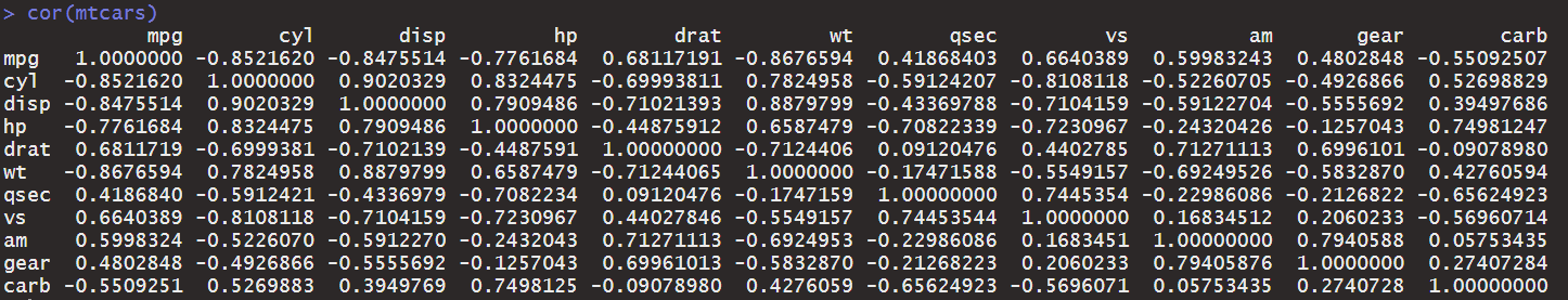
可以使用cor()函数获得变量之间的相关关系:
Correlation, Variance and Covariance (Matrices):
1 2 3 4 5 6 7 8 9 10 ( x, y = NULL , na.rm = FALSE , use) ( x, y = NULL , use = "everything" , = c ( "pearson" , "kendall" , "spearman" ) ) ( x, y = NULL , use = "everything" , = c ( "pearson" , "kendall" , "spearman" ) ) ( V)
参数
描述
x
a numeric vector, matrix or data frame.
y
NULL (default) or a vector, matrix or data frame with compatible dimensions to x. The default is equivalent to y = x (but more efficient).
na.rm
logical. Should missing values be removed?
use
an optional character string giving a method for computing covariances in the presence of missing values. This must be (an abbreviation of) one of the strings "everything", "all.obs", "complete.obs", "na.or.complete", or "pairwise.complete.obs".
method
a character string indicating which correlation coefficient (or covariance) is to be computed. One of "pearson" (default), "kendall", or "spearman": can be abbreviated.
V
symmetric numeric matrix, usually positive definite such as a covariance matrix.
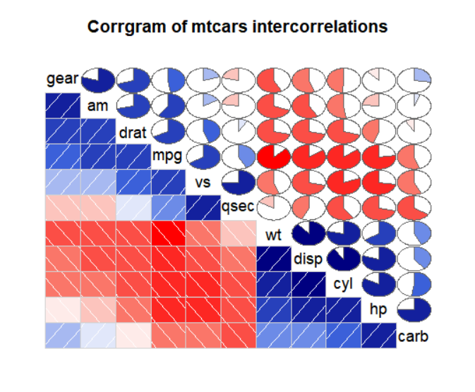
在绘制相关图的时候,利用corrgram包中的corrgram()函数,你可以用图形的方式展示该相关系数矩阵。
常用格式:corrgram(x, order=, panel=, text.panel=, diag.panel=)
1 2 3 4 5 6 7 8 9 10 ( x, type = NULL , order = FALSE , labels, = panel.shade, lower.panel = panel, = panel, diag.panel = NULL , = textPanel, label.pos = c ( 0.5 , 0.5 ) , = 0 , cex.labels = NULL , font.labels = 1 , = TRUE , dir = "" , = 0 , abs = FALSE , = colorRampPalette( c ( "red" , "salmon" , "white" , "royalblue" , "navy" ) ) , = "pearson" , outer.labels = NULL , ...)
参数
描述
x
一行一个观测的数据框
order
当order=TRUE时,相关矩阵将使用主成分分析法对变量重排序
lower.panel,upper.panel
设置主对角线下方和上方的元素类型
text.panel,diag.panel
主对角线元素类型
panel相关的参数如下:
位置
面板选项
描述
非对角线
panel.pie
用饼图的填充比例来表示相关性大小
panel.shade
用阴影的深度来表示相关性大小
panel.ellipse
画一个置信椭圆和平滑曲线
panel.pts
画一个散点图
panel.conf
画出相关性及置信区间
主对角线
panel.txt
输出变量名
panel.minmax
输出变量的最大最小值和变量名
panel.ednsity
输出核密度曲线和变量名
这部分以预设数据集mtcars为例,进行制图示例。
1 2 3 4 5 > library( corrgram) > corrgram( mtcars, order= TRUE , lower.panel= panel.shade, = panel.pie, text.panel= panel.txt, = "Corrgram of mtcars intercorrelations" )
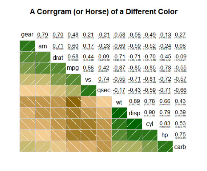
对于图像的解释(本图为了将有相似相关模式的变量聚集在一起,对矩阵的行和列都重新进行了排序(使用主成分法)):
蓝色和从左下指向右上的斜杠表示单元格中的两个变量呈正相关。反过来,红色和从左上指向右下的斜杠表示变量呈负相关。
色彩越深,饱和度越高,说明变量相关性越大。相关性接近于0的单元格基本无色。
从图中含阴影的单元格中可以看到,gear、am、drat和mpg相互间呈正相关。wt、disp、hp和carb相互间也呈正相关。但第一组变量与第二组变量呈负相关。
carb和am、vs和gear、vs和am以及drat和qsec四组变量间的相关性很弱。
上三角单元格用饼图展示了相同的信息。颜色的功能同上,但相关性大小由被填充的饼图块的大小来展示。正相关性将从12点钟处开始顺时针填充饼图,而负相关性则逆时针方向填充饼图。
其它示例:
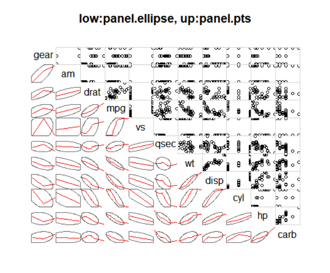
1 2 3 > corrgram( mtcars, order= TRUE , lower.panel= panel.ellipse, + upper.panel= panel.pts, text.panel= panel.txt, + main= "low:panel.ellipse, up:panel.pts" )
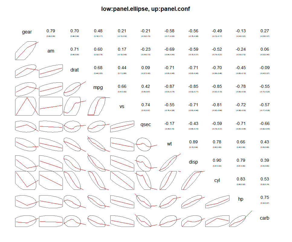
1 2 3 > corrgram( mtcars, order= TRUE , lower.panel= panel.ellipse, + upper.panel= panel.conf, text.panel= panel.txt, + main= "low:panel.ellipse, up:panel.conf" )
可以使用col.corrgram或在corrgram()函数中使用col.regions参数更改颜色:
1 2 3 4 5 6 > cols <- colorRampPalette( c ( "darkgoldenrod4" , "burlywood1" , + "darkkhaki" , "darkgreen" ) ) > corrgram( mtcars, order= TRUE , col.regions= cols, + lower.panel= panel.shade, + upper.panel= panel.conf, text.panel= panel.txt, + main= "A Corrgram (or Horse) of a Different Color" )